Responsive Layouts
In the age of multi-device consumers, responsive design is not just an option—it's essential. Wentytech's responsive design services ensure your website or app looks great and functions flawlessly across all devices, from desktops to smartphones. Our approach focuses on flexible layouts, responsive images, and media queries to create seamless user experiences that adapt to any screen size or orientation.
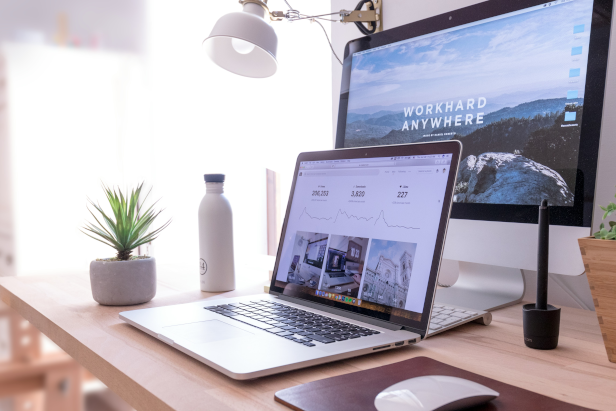
Optimized Performance Across All Devices
Responsive design is pivotal in today’s digital world where the variety of device forms and sizes is continually expanding. Wentytech ensures that your digital presence is beautiful and accessible on every screen, without losing functionality or aesthetic appeal. Our strategic implementation of responsive design improves your site's accessibility, decreases bounce rates, and enhances user retention.
Responsive design is a fundamental aspect of modern web development that ensures a website is accessible and aesthetically pleasing across all devices. This approach uses flexible layouts, images, and cascading style sheet (CSS) media queries to adapt the display of content according to the screen size and orientation. By doing so, responsive design eliminates the need for a different design and development phase for each new gadget on the market, saving time and money while providing a seamless user experience.
The implementation of responsive design improves site manageability, increases reach to tablet and mobile audiences, and enhances SEO efforts by directing all users to a single site no matter what device they are using. As mobile traffic continues to grow at a rapid pace, having a website that is effective and easy to use on both desktop and mobile devices is no longer just an option but a critical component of a comprehensive online strategy. This approach not only caters to today’s multi-platform consumers but also prepares your site for future scalability as new devices enter the market.
Fluid Grids
Fluid grid layouts are implemented to scale seamlessly across different screen sizes and orientations, ensuring consistent usability and aesthetic integrity across all devices.
Get free quoteAdaptive Images
Adaptive images are used to automatically adjust for different devices, enhancing load times and improving performance across all device types.
Get free quoteMedia Queries
CSS Media Queries are leveraged to apply different styles for various devices, ensuring your site is just as functional and attractive on mobile phones as it is on large monitors.
Get free quote*Ensure your website performs beautifully on any device with Wentytech’s responsive design expertise.
Responsive Design Facts
- Mobile First: Over 50% of all global web traffic now comes from mobile devices, making responsive design a critical strategy for enhancing user engagement.
- SEO Advantage: Responsive design is Google’s recommended design pattern, crucial for maintaining higher rankings in search engine results.
- User Satisfaction: 57% of internet users say they won’t recommend a business with a poorly designed mobile website.
How We Can Help
At Wentytech, we specialize in creating responsive websites that adapt to any screen size. Our team prioritizes optimization and design fluidity, ensuring that your website provides an excellent user experience, regardless of the device used to access it. We focus on technical precision and creative design solutions to meet the challenges of today's diverse device landscape.